
Section types
Every section you can add in the theme editor, such as hero, product row, category tiles, columns, slideshow and contact form, with its settings.
In the admin: Online storeThemeCustomise
On this page
This is the reference for every section you can add in the theme editor, what it is for, where it can go and the settings it has. To learn how to add and move sections, see Add, hide and arrange sections.
Almost every section below also has a Section style group with colour scheme, spacing, width and the screens it shows on. It is explained once in Style a single section.
Where each section can go
| Section | Header | Page | Footer | Inside a column |
|---|---|---|---|---|
| Announcement bar | Yes | |||
| Hero | Yes | |||
| Promo tiles | Yes | |||
| Trust strip | Yes | Yes | Yes | |
| Category tiles | Yes | |||
| Product row | Yes | Yes | ||
| Brand strip | Yes | |||
| Image with text | Yes | Yes | ||
| Rich text | Yes | Yes | Yes | Yes |
| Slideshow | Yes | Yes | ||
| Columns | Yes | Yes | ||
| Block | Yes | |||
| Contact form | Home page and content pages | |||
| Category tip tile | Category page |
"Page" means the home page and every other page in the page picker, unless the table says otherwise.
Announcement bar
A thin bar at the very top of every page, for one short message such as "Free delivery over €50".
- Text: the message.
- Link: optional. The whole bar becomes a link.
- Icon: No icon, Delivery truck, Percent sign, Price tag, Gift, Clock, Information or Megaphone.
Hero
The large banner at the top of a home page: a picture with a heading, a line of text and a button. It can hold several slides.
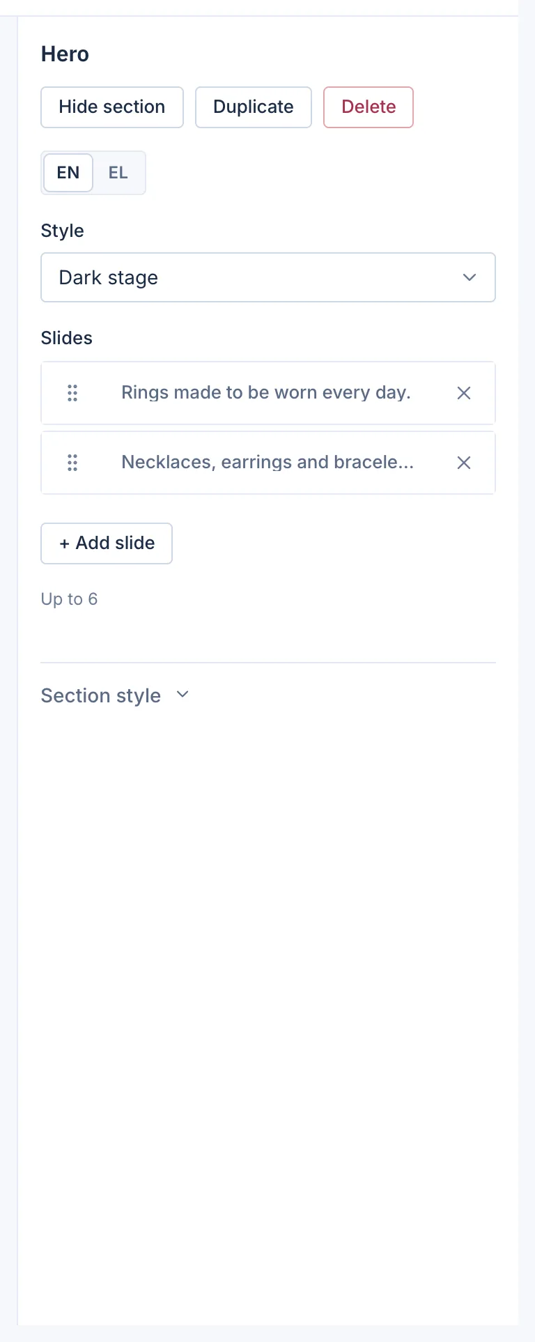
Style:
- Classic: the slides sit in a strip the customer swipes or scrolls through.
- Progress tabs: one slide at a time with the text beside the picture, and under it one bar per slide, labelled with its heading, that fills as the slide plays. A click on a bar jumps to that slide.
- Dark stage: the classic strip on a dark background that the photo fades into. Made for Chrysos.
- Part number search: the first slide's heading and text over a dark background with a search box to find a part by number. The slide's button becomes a small help link under the box. Made for Spool.
- Slides, up to 6. Each has Image, Heading, Text, Button text and Button link. The button shows only when it has a text.
Promo tiles
Up to 4 tiles side by side that point to an offer, a category or a collection.
- Tiles: each with Image, Heading, Text and Link.
- Colour style: Accent colour or Dark.
Trust strip
A row of short promises with icons: fast delivery, easy returns, secure payment.
- Items, up to 8. Each has an Icon (Delivery truck, Return arrow, Shield, Lock, Shop front, Parcel or Handshake), a Title and a Line of text.
- Style: Normal, or Band in the accent colour, which adds a turning Stamp text of up to 48 characters.
Category tiles
Pictures of your categories that lead to them. Each tile uses the category's own picture and name, which you set in Catalog.
- Title: the heading above the tiles.
- Which categories: The top ones, chosen for you or The ones you pick.
- Picked categories: up to 12, shown when you pick them yourself.
- How many: up to 12.
- Layout: Grid, Slider with arrows or Index list.
Product row
A row of product cards. This is the section you will use most: new arrivals, bestsellers, a sale, a collection.
- Title: the heading above the row.
- Products: where the products come from: Newest, Bestsellers, On sale, A collection, A category, or Related products. Related products works only on the product page and shows products related to the one the customer is looking at.
- Collection or Category: shown when you choose one of those as the source.
- How many: up to 12.
- Layout: Grid or One row that scrolls, with previous and next arrows.
- Cards per row: Theme default, 3, 4 or 5, on a computer. Tablets show 3 and phones 2 whatever you choose.
- See all link: optional, a link under the row, for example to the whole collection.
Only products that customers may see are shown. Hidden and draft products never appear.
Brand strip
Your brands' logos, each linking to the brand's page.
- Title
- Brands: up to 12. Leave empty to show them automatically.
- Layout: Grid or Scrolling strip, a slow endless line of logos.
Image with text
A picture beside a block of text with an optional button. Good for your story, a new range or a guide.
- Beside the text: Picture, or A question and answer, which shows a question and its answer as chat bubbles instead of a picture, with a Question, an Answer and Signed by.
- Image
- Heading and Text. The text can have bold, italics, links and lists.
- Button text and Button link
- Image side: Image first or Image last.
Rich text
A heading and formatted text, for a welcome message or a short notice.
- Heading
- Text: with bold, italics, links and lists.
- Style: Normal, or Statement (one large sentence), which sets one short sentence in large type.
Slideshow
Shows one of the slideshows you made in Online store > Slideshows. The slides, timing, arrows and height belong to the slideshow itself, so you change them there. See Create a slideshow.
- Slideshow: which one to show.
- Style: Classic or Progress tabs.
Columns
Two or three columns side by side, each holding its own sections. See Put sections side by side with Columns.
- Layout: Two halves, One third, two thirds, Two thirds, one third or Three thirds.
- Column 1 colours (2, 3): Theme default, Page, Soft, Accent or Dark.
Block
A small piece that lives only inside a column. Choose its kind in Block:
- Text: formatted text.
- Picture: with a Description for screen readers and an optional Link.
- Button: Button text, Link and Button style (Filled or Outlined).
- Video: one of your shop's videos, with Play by itself (muted, looping).
- Product: one product card. Type part of a product name or its SKU to find it.
- Slideshow: one of your slideshows.
Contact form
A form visitors use to send you a message. It can go on the home page and on content pages. The Contact page has it already. See The contact form.
- Heading (empty shows "Send us a message")
- Intro text: up to 300 characters.
- Button label (empty shows "Send")
Category tip tile
A small box with advice that takes the place of one product card on category pages, for example "Not sure of your size? Read our guide". Only on the category page.
- Heading (up to 80 characters), Text (up to 160), Link text (up to 40) and Link.
Sections from apps
Some apps add sections of their own, for example product reviews on the product page, or a set builder and shop the look on the home page and listing pages. They show in Add a section only while the app is open in your shop. See Apps.
In a marketplace there is also a Seller row, which shows sellers with their logos.
Related
Updated 13 November 2026