
Change colours, fonts and buttons
Use the Styles tab to set your palette and colours, fonts and text size, buttons, page width, spacing, corners and product cards.
In the admin: Online storeThemeCustomiseStyles
On this page
The Styles tab of the theme editor sets the look of your whole shop at once: the colours, the fonts, the buttons, the page width and the style of product cards. Use it to match the shop to your brand. Every change goes into your draft and shows in the preview straight away. Customers see it after you press Publish.
The checkout keeps its own simple look and is not changed by Styles.
Open Styles
- Go to Online store > Theme and press Customise.
- Click the Styles tab in the left column.
The tab has four parts: Layout, Colours, Buttons and Type. There is no Save button: each change saves itself into your draft.
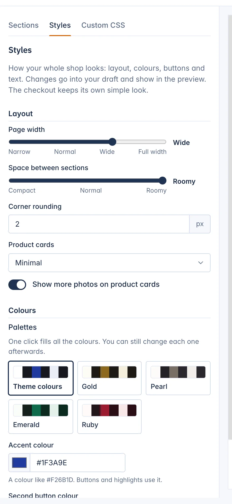
Layout
- Page width: how wide the content of your pages can get on a large screen: Narrow, Normal, Wide or Full width.
- Space between sections: Compact, Normal or Roomy.
- Corner rounding: how round the corners in your shop are, in pixels, from 0 (square) to 20.
Product cards: how products show in grids and rows:
- Tile with a soft background
- Outline
- Minimal
- Tall picture (3:4), good for fashion
- Arched picture, with a rounded top
- Show more photos on product cards: adds a product's other photos to its card, so customers can look at more than the first picture without opening the product.
Colours
Palettes
The quickest way to change your colours is a palette. Each theme comes with five, starting with Theme colours, the theme's own. Click a palette card and all the colours below are filled in at once. You can still change each colour afterwards. When your colours no longer match any palette, the editor says Your own colours.
| Theme | Palettes |
|---|---|
| Ampere | Theme colours, Ocean, Forest, Graphite, Berry |
| Chrysos | Theme colours, Gold, Pearl, Emerald, Ruby |
| Moda | Theme colours, Sand, Noir, Rose, Olive |
| Salve | Theme colours, Sage, Clay, Lavender, Sea |
| Spool | Theme colours, Signal orange, Teal, Graphite, Racing red |
Your own colours
Each colour is a code like #F26B1D. Type it, or pick it with the colour swatch.
- Accent colour: buttons and highlights.
- Second button colour: the less important buttons. Their text turns dark or white by itself so it stays readable. Left at
#1C1C1C, these buttons follow your text colour. - Background colour: the page background.
- Text colour: the main text.
If your text and background colours are hard to read together, a warning says so. Readable text needs a contrast of at least 4.5 to 1. You can still save the colours, but a darker text or a lighter background helps every shopper.
Section colours
Sections can use a Soft or Dark colour scheme, chosen in each section's Section style (see Style a single section). Here you set what those schemes look like:
- Soft background and Soft text colour
- Dark background and Dark text colour
Leave a field empty and it follows your theme's colours. The editor shows which colour it follows. A pair whose text would be hard to read, under the 4.5 to 1 contrast, is refused.
The Accent scheme uses your accent colour, and Page uses your background and text colours.
Buttons
- Button style: Filled or Outlined.
- Button shape: Square, Rounded (follows Corner rounding) or Pill.
Type
- Font for headings and Font for text. You can mix any two of these: Archivo, Geist, Bodoni Moda, Instrument Sans, Young Serif, Funnel Sans, Cormorant Garamond, Hanken Grotesk, Saira, Public Sans, or The device's own font, which uses the font of the customer's phone or computer and loads fastest.
- Text size: Small, Normal or Large.
The fonts are served by your shop itself, so no font service sees your customers.
Undo a style change
There is no undo button, but you have three ways back:
- Click Theme colours to go back to the theme's own colours.
- Press Discard draft to throw away every change since the last publish.
- Open Versions to restore an earlier published version.
See Publish, restore and switch themes.
Related
Updated 13 November 2026